Let me make a start on this post by showing a photo of a lovely cloud formation a few nights ago
the last rays of the sun were catching the edge of the cloud, I made out onto the drive to take a photograph
and love looking at this, it will be printed out and pinned above my cutting table, perhaps it will cause the frustration I'm feeling presently to dissipate!
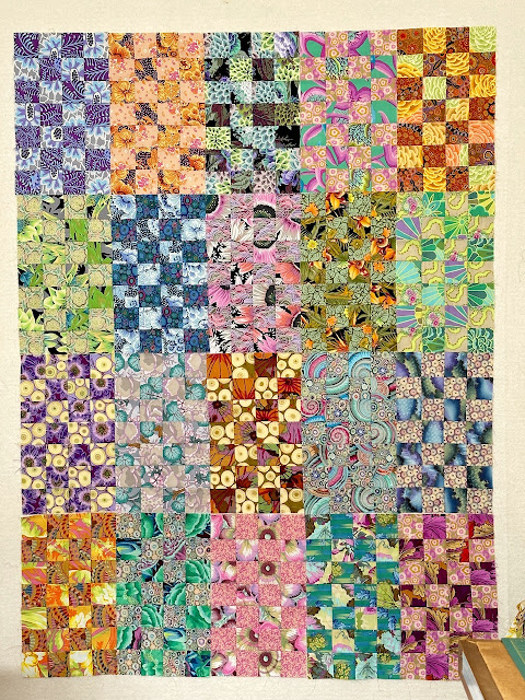
Maggie Pearl has been frustrating me no end. I have seen quite a few of these quilts and they were beautifully restrained with soft colours, yes, why not try passing on my usual colour choices and go restrained, I wish I hadn't followed that particular path. Blocks were made and up on the design wall they went, more blocks were made and even more blocks, I still wasn't too happy at all.
Layout two days ago and excuse the uneven photograph, I was perched on a set of drawers all set up with a bed for Leila, also the blocks are just 'thrown' up there leading to some higher than others
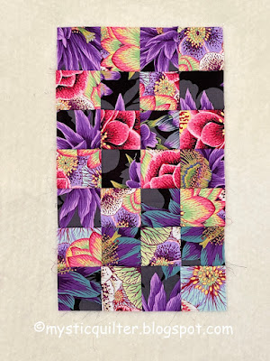
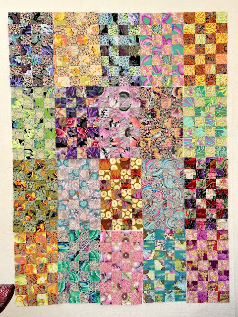
I didn't feel this was a 'me' quilt in progress. What would happen if I changed things around and added bold and bright blocks in the style of the middle block third row down, here they are again



13 comments:
I say “Whatever makes you happy” . The subtle colors are lovely. The bold colors are great. If it feels right, do it.
I do like your first setting; it would be difficult for me to find an element to give some cohesion on this, too! Perhaps make it into columns with sashing in between? Or probably not what you envisioned...just a thought...
That is one gorgeous cloud formation--such lovely colors...Hope you are enjoying your sewing time...Stay well hugs, Julierose
I like your first layout except the block second in on the second row. It seems too dark for all of the rest of the blocks. I would just make one more softer contrast for that spot.
As far as the darker blocks you have made? A second quilt is what I would do with them, all higher contrast and bolder colors.
I think I would revert to layout one shown here and make that into one quilt top. Then I would proceed to make more "you" blocks with your glorious KF brights and turn that into quilt top number two. I, too, have a love hate relationship with this pattern. I've cut strips for my version named "Ruth" but haven't started sewing yet (and I can't tell you how many other times I've pulled that pattern out but then set it aside in favor of another approach).
What if you took those warm color blocks and put them at the top. As you work down, the really bold ones could go at the bottom. The gradation of values to the darkest at the bottom may move the quilt in a more dynamic way. Then, cut out the strips you like and make one with your colors!
I really like this quilt you're working on. But I'm a total sucker for a sixteen patch and your riff on that is lovely.
I really wish I could look at your two versions side by side. However, I think I like the first version the most. It feels more homogeneous to me. It feels serene. While still not being shy about color.
I love the new and bolder blocks you made, but I'm not sure about them in the layout. I feel like you need a couple more bolder blocks added in.
With that all being said, I don't think you can go wrong with either layout.
I think I'm with Wanda and Julie here: make two versions! Your cloud photo is very pretty - I'm glad I'm not the only one who rushes outside to take pictures of the sky.
I think I'm with team Julie about this one, make two! But yeah, it's hard to do something so different than what we tend to like 'best'. If you're set on keeping the second layout, I'd make a darker block and switch out the very bottom block on the left side. That should create the balance you're looking for.
A lovely colourful post! Indecision hits us all from time to time... looking forward to seeing what you decided to do Maureen.
I think your blocks look very nice, and I don't think I can suggest any changes. You're on the right track. Though YOU may not think the quilt looks like you, it's still very attractive. Do you have a purpose for making it? To me that's the more important question. If you know you're keeping it to use yourself, then indeed, make changes to make it "you." However, if you're giving it to a particular person, consider what they would like. Or if you plan to donate it, keep going and don't think twice about your color decisions. Learn through the process.
Fun with design! I'm inspired by your thoughtful effort to get it right.
I get like that sometimes and then I panic because it seems like I should be able to come to a conclusion right away. Thank you for sharing, I feel like we have a similar design process here and that's a comfort.
I agree with Julie, Wanda, and Kaja that the first one looks good. It's not you but it is someone. I make lots of scrap baby quilts and one of the important lessons I have to relearn regularly is that different people respond to different palettes. Last year I made one I thought was supremely ugly and sent it to my kids as one to gift to some baby; then my granddaughter called and wanted it herself.
It's tough to work on things we don't really like, isn't it?
I'm standing with Team Wanda & Julie - and with Kaja and Ann, too. (It's getting to be a big team!) Making two quilts will give you all the scope you need.
But in the end, do what pleases YOU the most. Up to and including burying the unloved quilt top in the garden, if that's what you want!
Post a Comment